Over a decade ago we launched the brand that epitomises the sum of the different vineyards in Rioja, from north to south and east to west: Viña Eguía. Viña Eguía has been a success in many markets, to the point that nowadays it is a symbol of versatility, coherence and an open and friendly style. A 100% Rioja wine which, like all genuine characters, welcomes a renewal with enthusiasm and joy. And thus, it will remain in the limelight for a long time to come.
Viña Eguía unveils its new image.
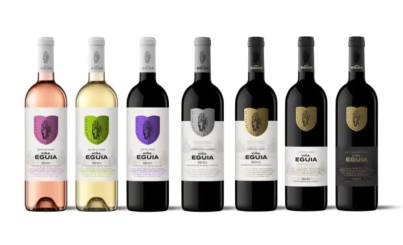
A fresh look that fits in with the present times and with the wine's personality. To explain its new appearance, we spoke to its creators, MORUBA design studio, one of Spain's most prominent creative teams.
What do you hope to achieve with the new label designs for Viña Eguía?
The main goal is to refresh the look of the brand and bring it in line with the values of today's consumers. To do this, we must not lose the connection with the previous design. It is a case of striking a balance between tradition and future.
Which elements have you played with?
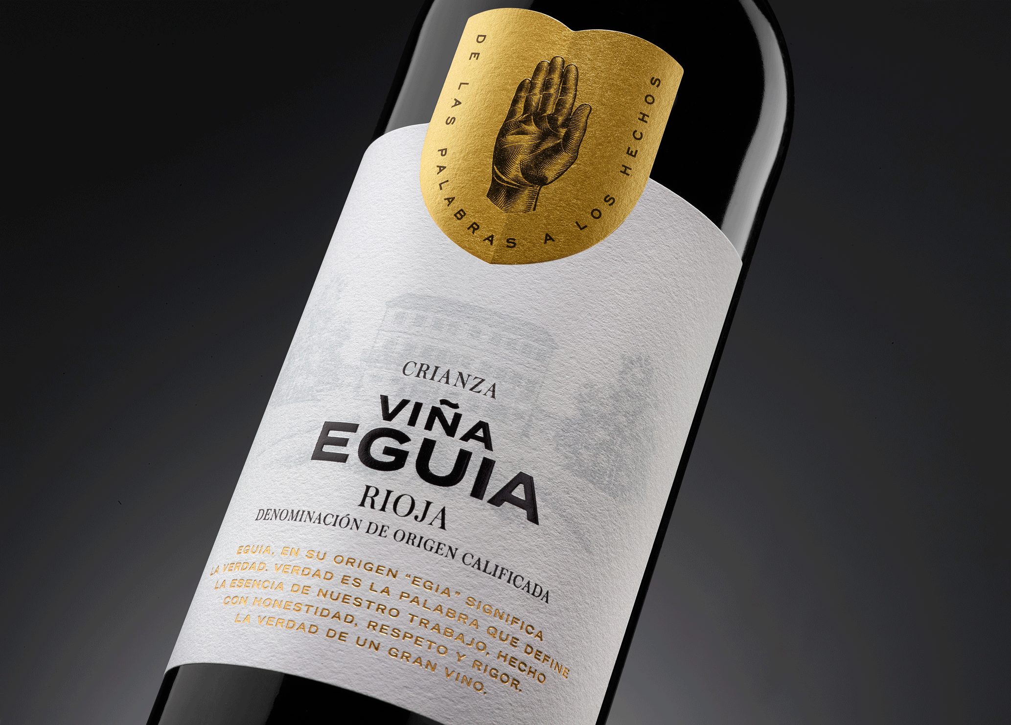
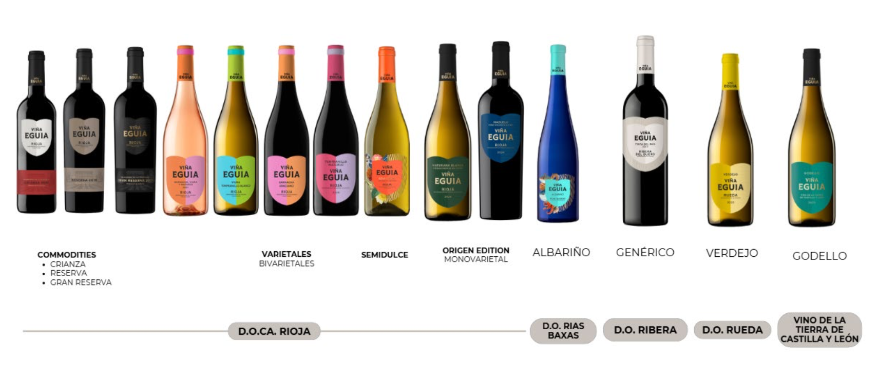
Firstly, we have given greater prominence to the "hand of truth" symbol. The word Eguía comes from egia, which means "the truth? in Basque. The meaning is clear and straightforward: it is an honest wine, containing authenticity and honesty. This connotation is so important that we have decided to strengthen it with a shield. Furthermore, this shield changes colour depending on the type of wine, with brighter shades for the young wines and subdued, more classic colours for the crianza and reserva wines.
The font has also changed.
Indeed, that is the second great intervention. We have replaced the Roman typeface with a sans serif type ?it is both striking and very contemporary at the same time.
What does this typeface bring?
A sense of greater relevance, clarity and objectivity. The combination of the shield, which evokes tradition, and the sans-serif typeface, in a style that is professionally known as "grotesque", creates an image of greater strength and prominence. It seems to say "I am a brand that is worthy of consideration".
When consumers see these bottles, what would you like them to think?
That these are wines with tremendous personality, which appeal to everyone. If you are a fan of classic Riojas, the symmetry and balance of its elements will please you. In the case of a very dynamic consumer, the kind who is always tasting very different wines, they are attracted by this blend of tradition and modernity. And then, the lively and colourful look of the younger Eguía wines seduces people who are looking for fresh and accessible wines.
Does the design of a wine brand need to change over time?
Renovation is always a good thing. Some brands require more profound changes than others, but all of them, at some point in their career, need some adjustments. After all, wine is a living product. And the markets, even more so. It is about offering an image in keeping with our times without losing touch with the roots and the history of the brand.
Finally, a special wish to all our readers: we hope you enjoy this new chapter in the life of Viña Eguía.