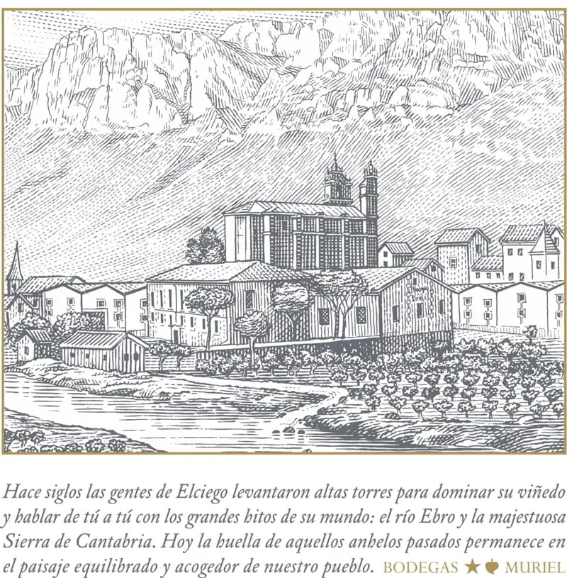
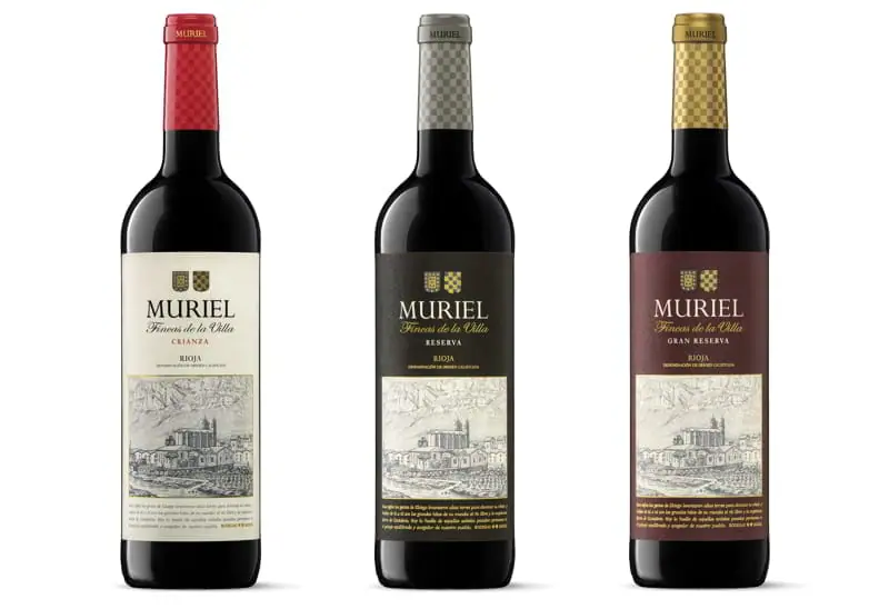
The design of the label in 2014 was a great PR coup. We were not looking for anything audacious or with an immediate impact. Our aim was to convey the truth in a calm manner, based on a profound message that would sink in over time. The landscape illustration took us to discover an exciting language, which is both intimate and timeless.
The Sierra de Cantabria mountains frame the scenery. The village of Elciego, with the winery and the imposing church, occupies the centre of the composition, surrounded by vineyards. On the foreground, the river Ebro flows serene and benevolent. It is a beautiful and free interpretation of our geographical origins. The author, Norwegian artist Martin Mock, was able to capture our singularity. And Moruba, the design studio, provided the label?s graphic structure with a balanced, long-lasting tone set to withstand any passing trends. Simply genuine.
 "
"